This is a review for Toot! – a Mastodon iOS client, after using it for a week.
My friend snullp made his Mastodon instance public – c7.io, and I think the federalism is the future for social networks, so I joined his instance right away. Naturally, I used the official Mastodon iOS client at the beginning, which is easy to use, pretty simple, and it works. However, when I was using it, it had a very annoying bug: every time there’s a notification, and I clicked on it, the app would exit right away sometimes. Finally I had enough of it, so I started my search for a third party iOS client.
Snullp recommended tooot, a free app from developer Zhiyuan Zheng. It seems to be a nice replacement for the official app, with the UI looking pretty simple and elegant. However, right after I logged in, I found a bug: the banner image for my account doesn’t show up in the app. It became a really miserable experience for me since I spent almost an hour trying to make it work – I tried to scale down the image, and also cropped to 1500px by 500px. None of them worked. It is a disaster for a perfectionist like me. I did a bit research and found it’s a known bug, and I reported it to the developer within the app (it’s actually a DM directly to the developer).
At this point, I have both the official iOS app and tooot, and I switched between them from time to time, trying to figure out which I like better. In the case where both of them have very annoying bugs, I found another small thing of tooot that is inconvenient for me: It’s a little more difficult to switch between different Mastodon accounts (for those who don’t know, you can have different accounts on different Mastodon instances). In the official app, I can just long press the account icon at the bottom right corner, and a small menu will pop out with my accounts so I can choose one directly, without leaving current page / context; with tooot, it’ll open a new page in the app, with all accounts showing there, and then I can go to the account I want. It’s pretty inconvenient for me who has different personalities online. This became the new motivation for me to search for a new iOS client.
After simple search, I found Toot! in a Reddit post. Toot! isn’t free, priced at $3.99 which is actually pretty affordable. Of course my money doesn’t grow on a tree. It is the following statement in the App Store that touched me:
What makes Toot! special?
– It is delightful. It is full of beautiful design, animation, amusing details and hidden treasures.
I really want to try it if the developer dares to claim their app is “delightful”. We’re looking to get satisfied online. Social networks affects every aspect of our lives deeply – sometimes it makes us happy, sometimes it sends us into a death spiral of negativity and self-doubt. And a “delightful” app can affect us in a positive way. So I bought it and really had some high expectation for this app. After using it for a week, I think the developer isn’t over advertising at all.
Main page and UX
The main page after login is the feed (not sure if Mastodon has its own name for this?). I am not adding a screenshot of my feed for privacy reasons, but here’s the page of my account, which isn’t much different.
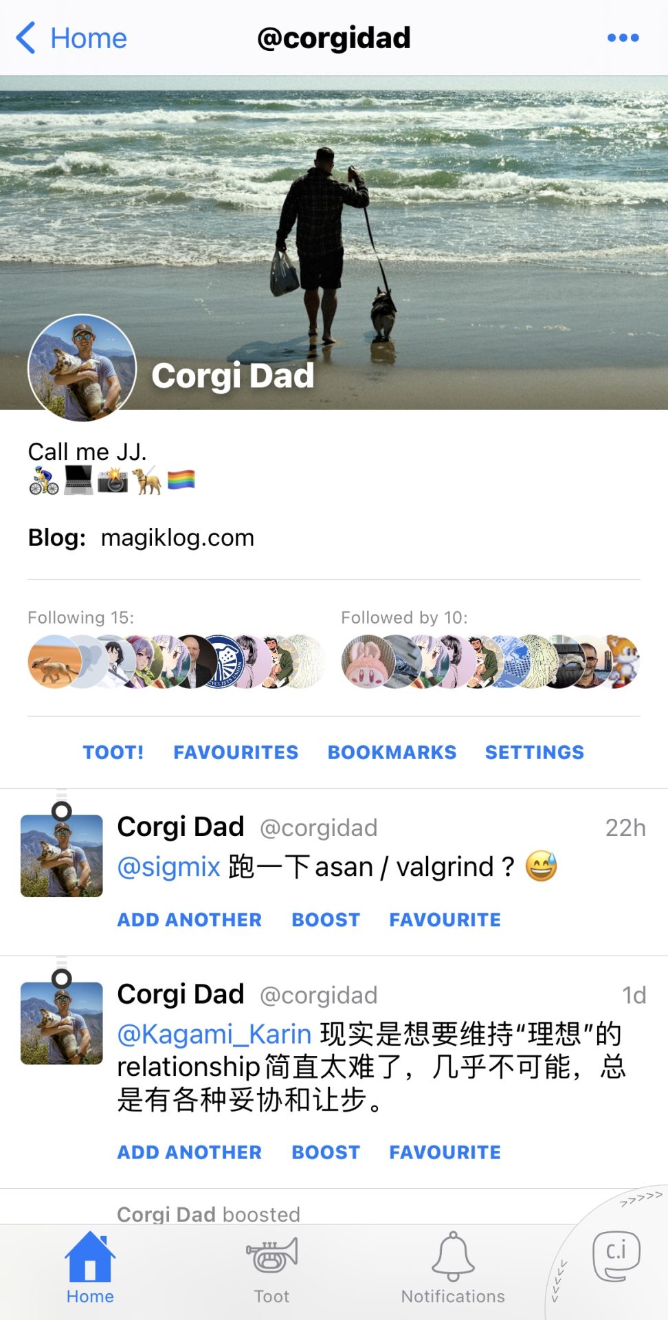
Username is shown in the center on the top. If the user you’re looking at is registered in a different instance, it’ll be shows as @username@instance_name.
Banner image shows up normally. If anything I want to point out here, Toot! Won’t show a gif avatar properly. It’ll be shown as a static image; official client and tooot can both show gif properly of an avatar.
The list of followers and who follows you is beautifully designed – like a stack of avatars.
Interestingly, the “buttons” to boost and favorite a toot is shown as text, not any sort of icon.
At the bottom of the page are Home Screen, Toot, Notifications and the icon to switch accounts (or show your own account). Clicking on the Toot icon will pop up three options:
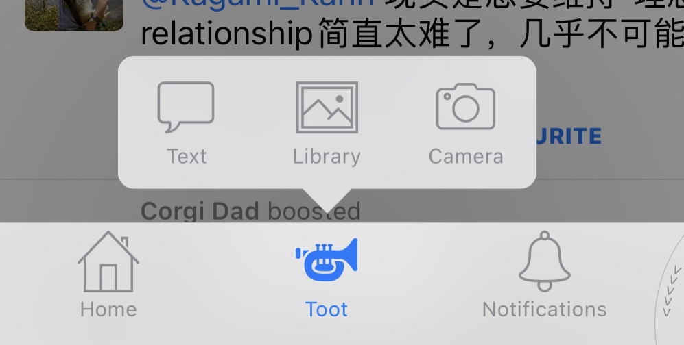
Text, choose photos from library, or use camera. I really like this design which allows me to post a pic really fast since I post a lot of photos.
The feature to switch between different accounts is on the right, which is probably my favorite UX design of Toot!.
Simply swiping up or down on that corner will switch between different accounts, and the animation is so smooth.
Embedded Replies
Another feature I really liked is embedded replies. Replies to a toot are shown in threads, which are distinguished by different colors (the following pic is from the developer, not mine):
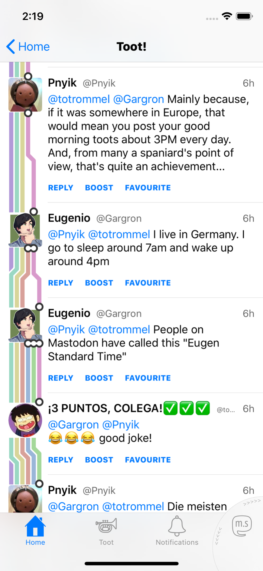
It seems like the latest version removed the colors of threads. Instead it’ll just show a grey thin line for each thread.
So, what makes a delightful app
Different users focus on different things, so all the opinions are just mine.
First of all, it’s the UX. Simple, smooth and refreshing UX always affect users positively. For example, the design of switching between accounts and its animation always makes me smile at first; I still find it a really user friendly design even after one week of heavy use. Of course the excitement will fade eventually. A good UX design makes using the app a natural flow, not only for some cool animation or design. The official app does a pretty good job switching accounts: long press -> choose, very simple; however, Toot! Goes further: not only simple, but also refreshing and cool.
Second, it’s UI design, including fonts, colors, and icons. Those visual elements affect users invisibly.
Last, it’s some fun features and designs, such as changing icons for different themes, and different animation effects for different features.
Conclusion
This is just reviews from my experiences. Toot! Still has many features and great designs. Though it’s cheap for $3.99, nobody’s money grows from a tree. I think I’ve reached my goal if you can decide for yourself that you want or don’t want Toot! After reading this article.
